Thursday, September 29, 2011
Tuesday, September 27, 2011
Developing the Theme
Student Life- These pages should really show what it is to be a student at WAIS. The pictures and the way the pages are decorated should relate to us. Maybe have things that use or like.
Club pages- These should have pictures of the club's activities, pics of the sponsor and the members. Its' format or design should tie in with the club's purpose. For example, if it's the Med Club, then have like doctor things or do like the heartbeat line.
Event pages- This part should be like dark for a background, so that the pictures stand out. Or like last year add effects to them to show a difference between those and the other pictures in the yearbook. Maybe make the captions bright colors or different font.
Photography Concepts
Depth of field is used here because the main idea is portrayed and the boat in the back serves like a background. Even though both items are shown, the fish is what is supposed to stand out, making it clearer than the boat.
Repetition is shown from the lines there. They are parallel and all go the same direction, repeating and not taking too much attention form helicopter.
Rule of thirds is shown because even though you want to see the pain the women are going through, you also want to see the real problem. But in order for the women not to take up too much attention the only take up 1/3 of the photograph's space.
Unusual angle is shown usually pictures are taken from our angle(horizontally) but this one was taken in a sideways angle. Making it possible to see the dogs, the girl and the line that is ahead of them.
This one would be leading lines because it was taken kind of form a sideways angle, making the lines go downward from one side to another. Leading our eye from one side of the photograph to the other in a parallel way.
Balance is shown because there is nothing that takes away from other things in the photo, they all have the same lighting and color level.
Fill the frame is shown because the main idea or what the photographer wants the ppl. to see, which is the volcano and its activity. There isn't another thing there to take away from the theme of the photograph.
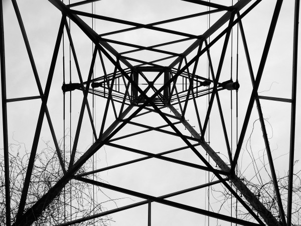
Due to, both sides of picture being equal or congruent, this one is symmetry. If you were to fold it vertically, then the picture would be the same on both sides.
Depth is shown here, because even though for the eye the fire looks like its right beside the man. In reality though its way behind him and you can see how it goes back.
For this picture it would be framing because of the angle it was taken from. The walls from the sides serve as a frame , making the center of the photo stand out.
Monday, September 26, 2011
Scavanger Hunt
 fill the frame-
 repetition photography
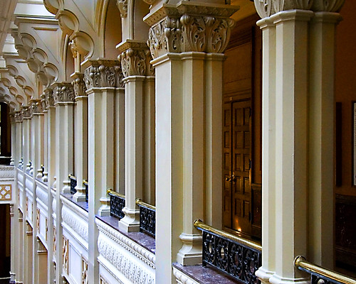
 symmetry
 Rule of thirds
Balance

leading lines
 depth of field
 Unusual angle
 depth photography
 framing
 Friday, September 2, 2011
"Notebook" Mock-up
This could be one of the inside cover, where the pictures could like taped onto the "notebook" page. The captions on the pictures could be in different fonts in one page(or change for each page), but in a font that shows like its written by a student or like note-kind. If the page is for a club it can have a group and sponsor picture. On the edges of paper there should be like "doodles" relating to the pages' theme, and/or put cool frames on it. Also make the page colorful, like not plain but bright.
Subscribe to:
Comments (Atom)


